Revisiting a Key Booking Page
Product & UX had the opportunity to revisit the Bags page, which is important because travelers make their initial bag selections there while booking.
Goals:
- Find the optimal design to increase the bag attach rate
- Introduce the ability for travelers to self-select new options (flying with a pet and adding more checked bag options).
TL;DR Impact:
- The bag attach rate increased by 3.7% within the first 2 weeks of launch
- 400+ pets added ( ~$30k in revenue) within the first 2 weeks of launch
Research & Insights
Before we redesigned a key ancillary page, we conducted strategic research in three main areas:
Based on 2 surveys, people expect to add a pet to their booking on the Bags page. This gave us confidence in having the pets experience as part of this redesign.
- We were considering a couple different booking flow pages for adding a pet
- The Bags page was one of those pages, so we built a couple surveys (one with friends & family, one with travelers) to gather insights
Our prototype tested well with participants and was rated positively.
- The design prototype we tested introduced more bags details content and new button interactions
- We conducted usability testing with employees who were not close to the project
Cropped portion of the early prototype that was tested
The new buttons tested well with participants and was rated positively. We were able to use this data to help champion the design changes we were proposing.
- In addition to the employee usability testing, we conducted a button-focused usability test with non-employees
- This data from these tests helped convince leadership of the button change
Cropped portion of the button prototype that was tested
Design Strategies
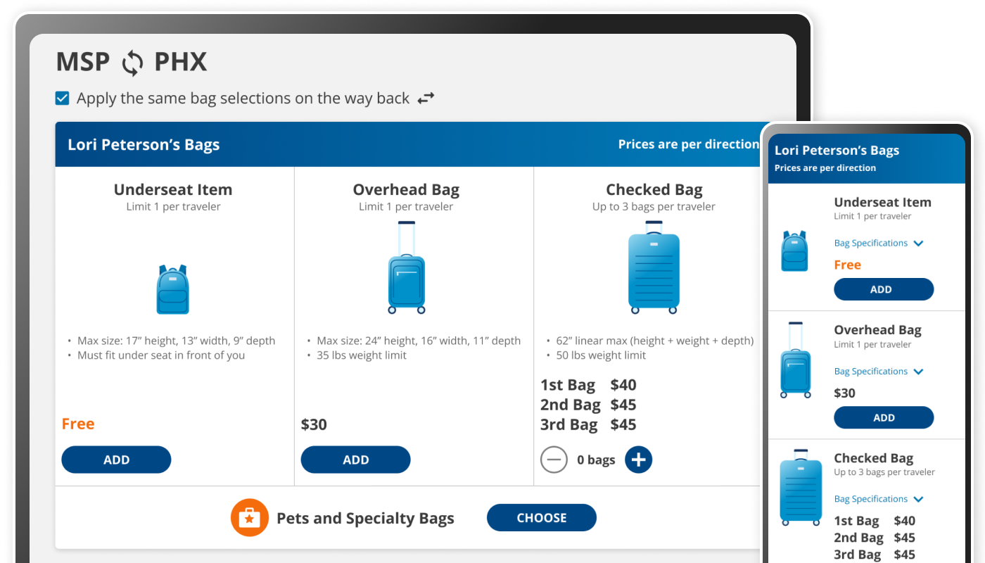
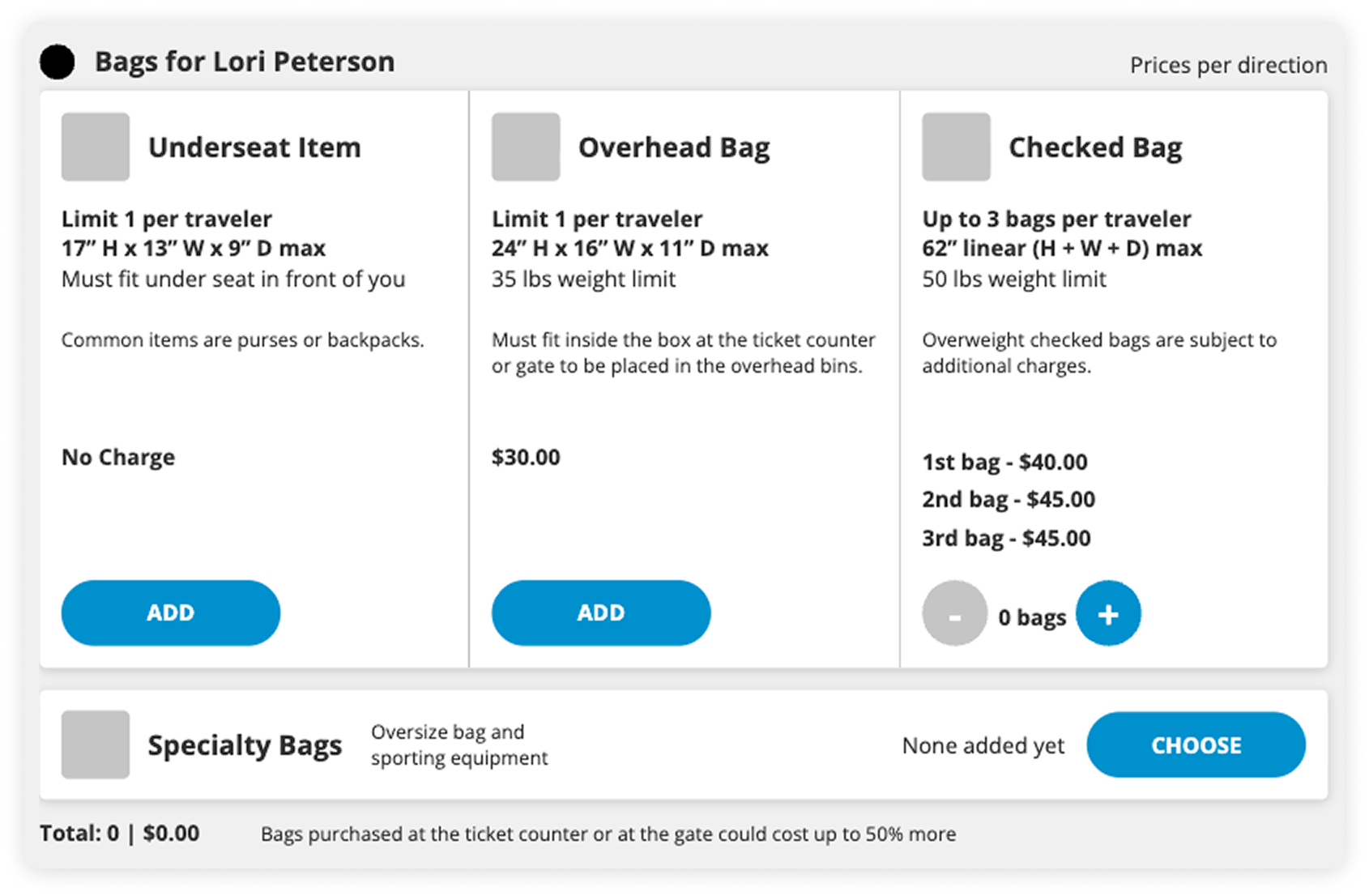
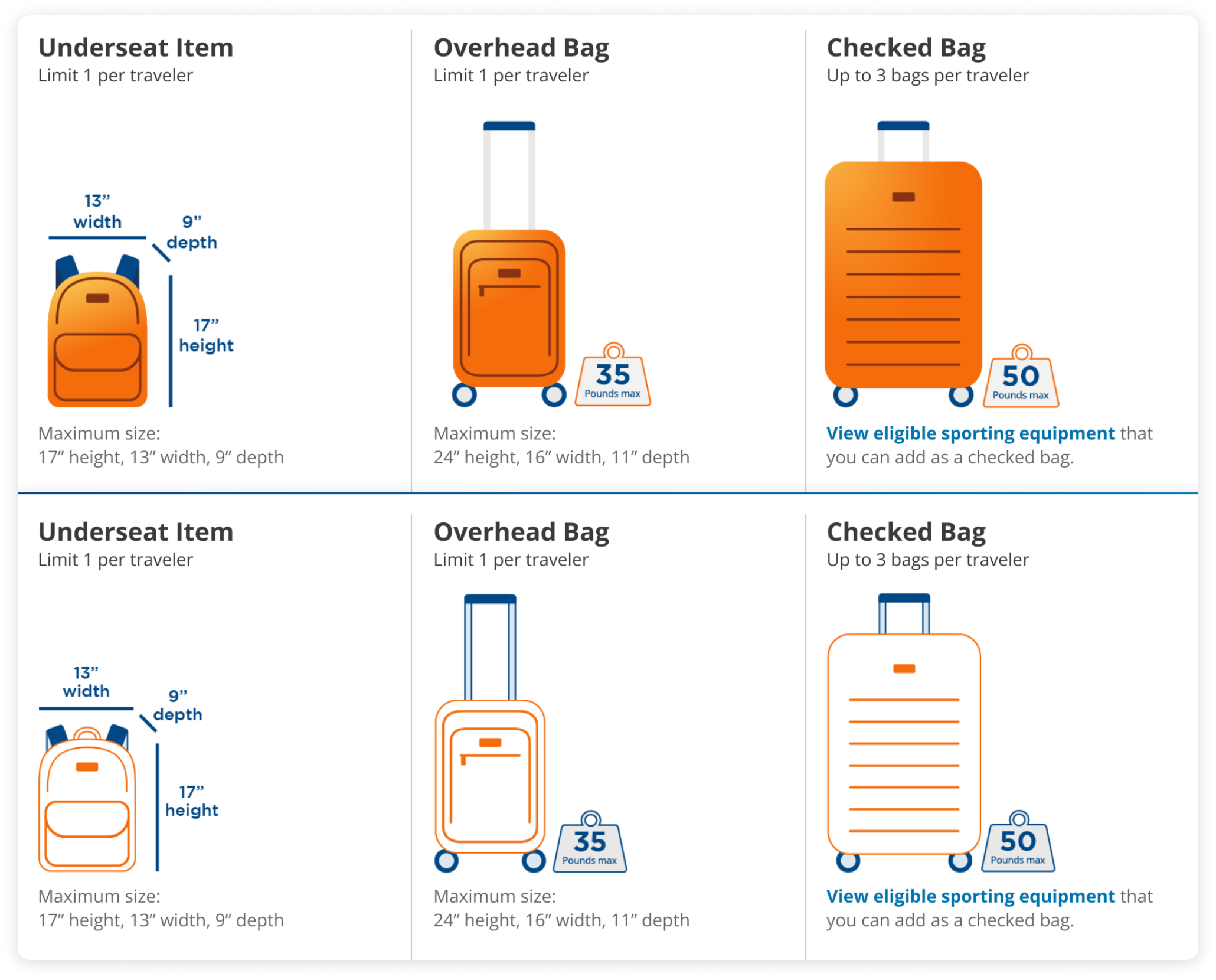
- Add new products in a sensible way: add pet and specialty bags options within the current organization where travelers expect
- Educate travelers: surface bag details content so travelers can make a decision on this page
- Highlight savings: add content about why making a bags purchase now will save money
- Improve button usability: update the buttons for all bags so it’s easier for travelers to interact with the page
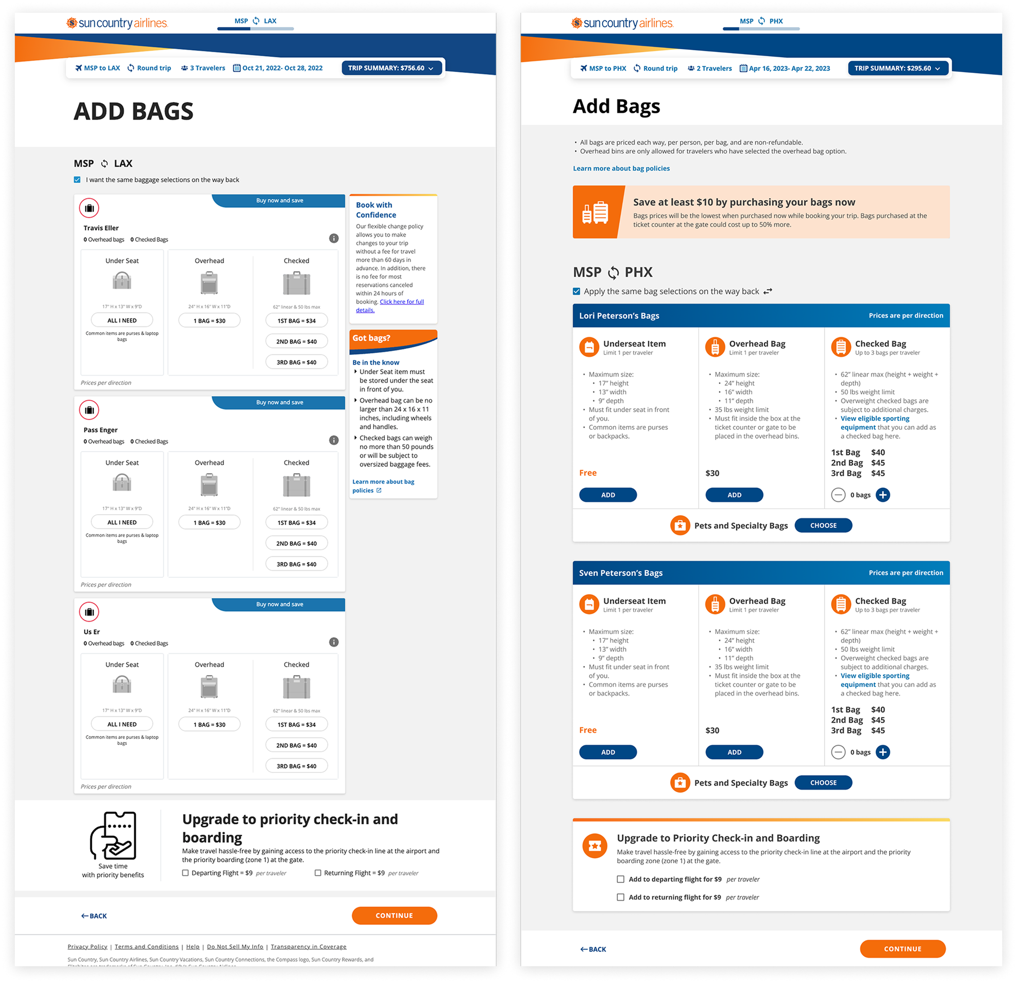
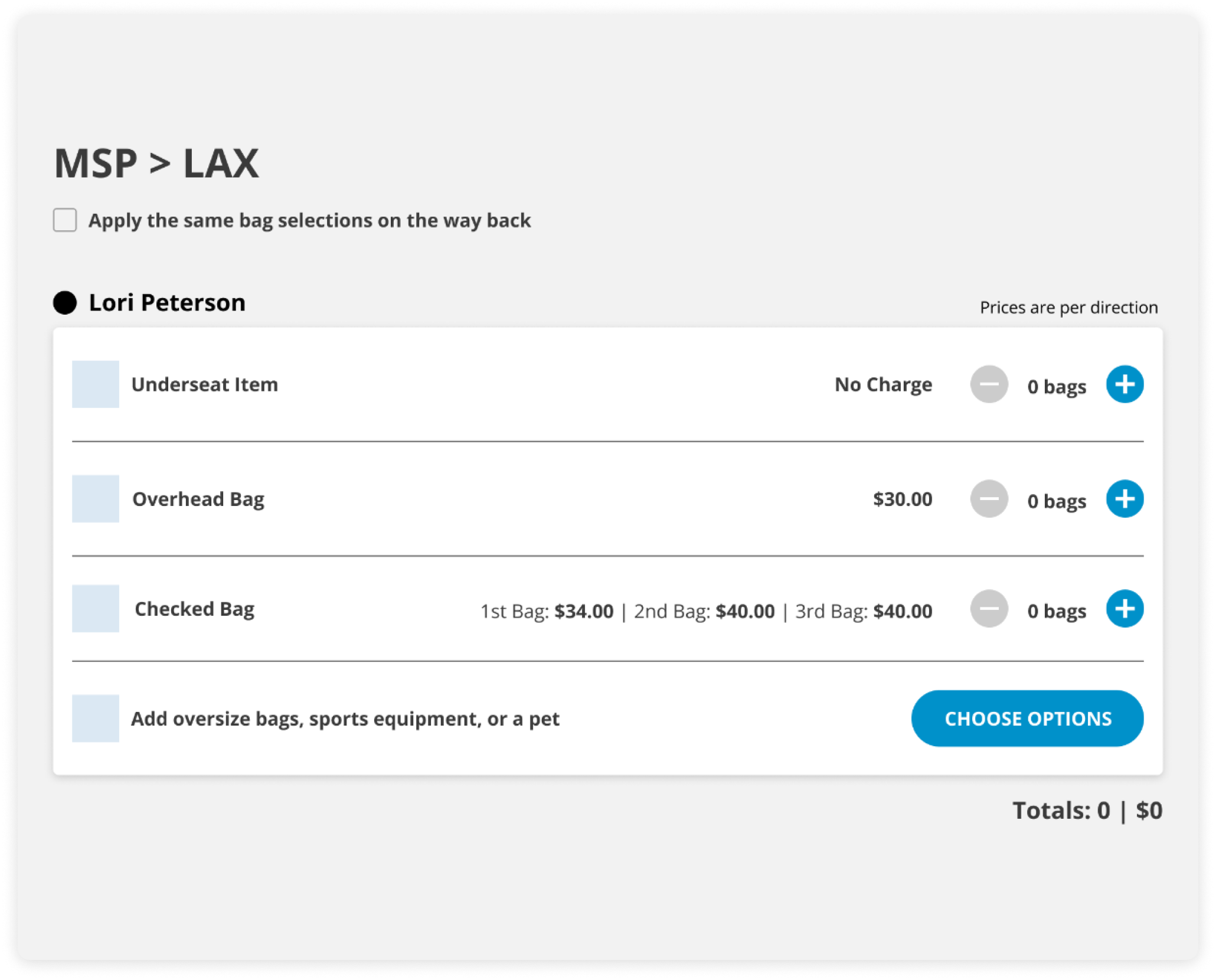
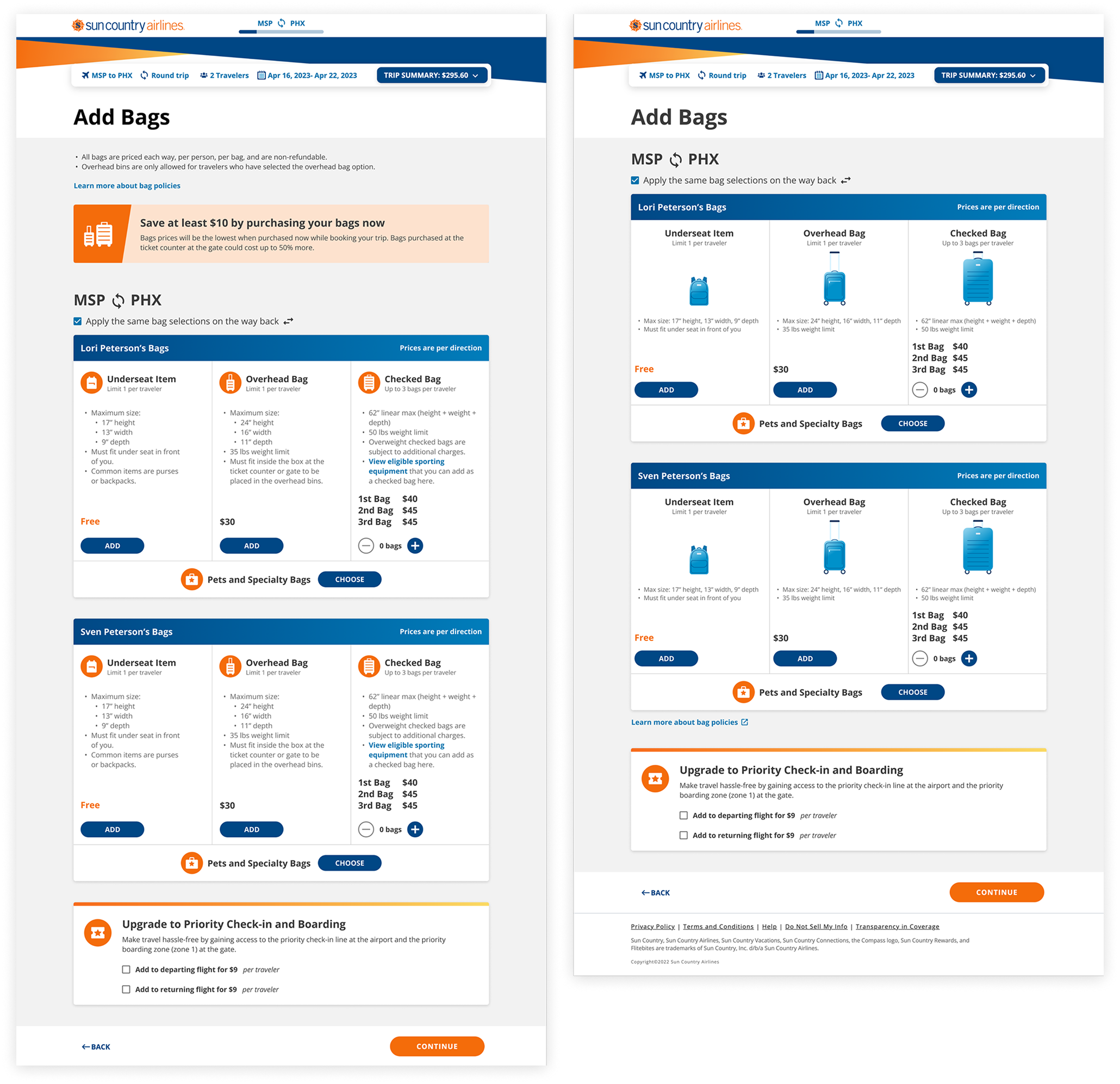
Left Image: Current Bags page | Right Image: Redesigned Bags page
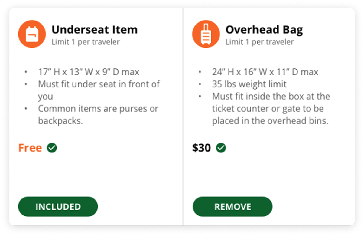
Button Update
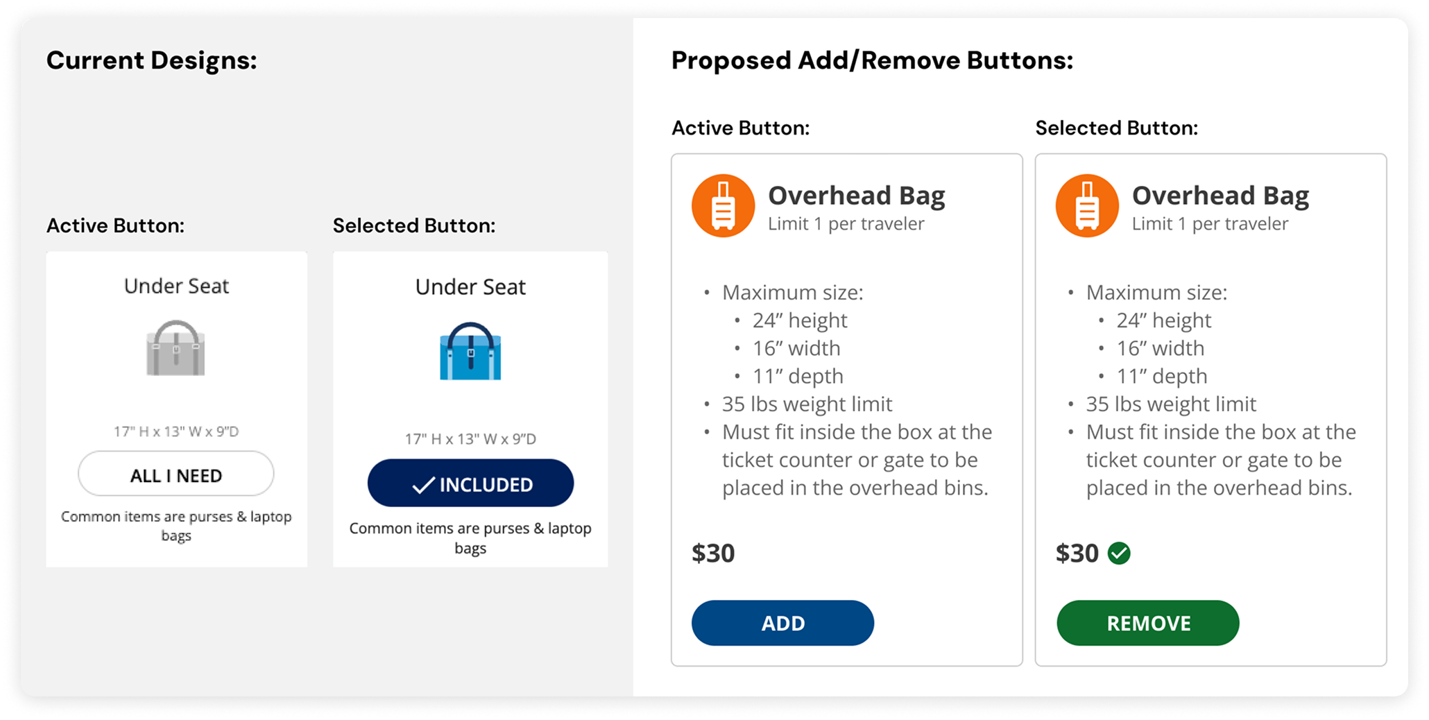
The proposed button design update, grounded in user research, made the select / unselect experience clearer with visual cues and content changes.
Comparison between the current button designs and the proposed add/remove button designs.
Select Exploration
1 of 3: An early bags card exploration
2 of 3: Exploring different bag illustration styles with the brand orange
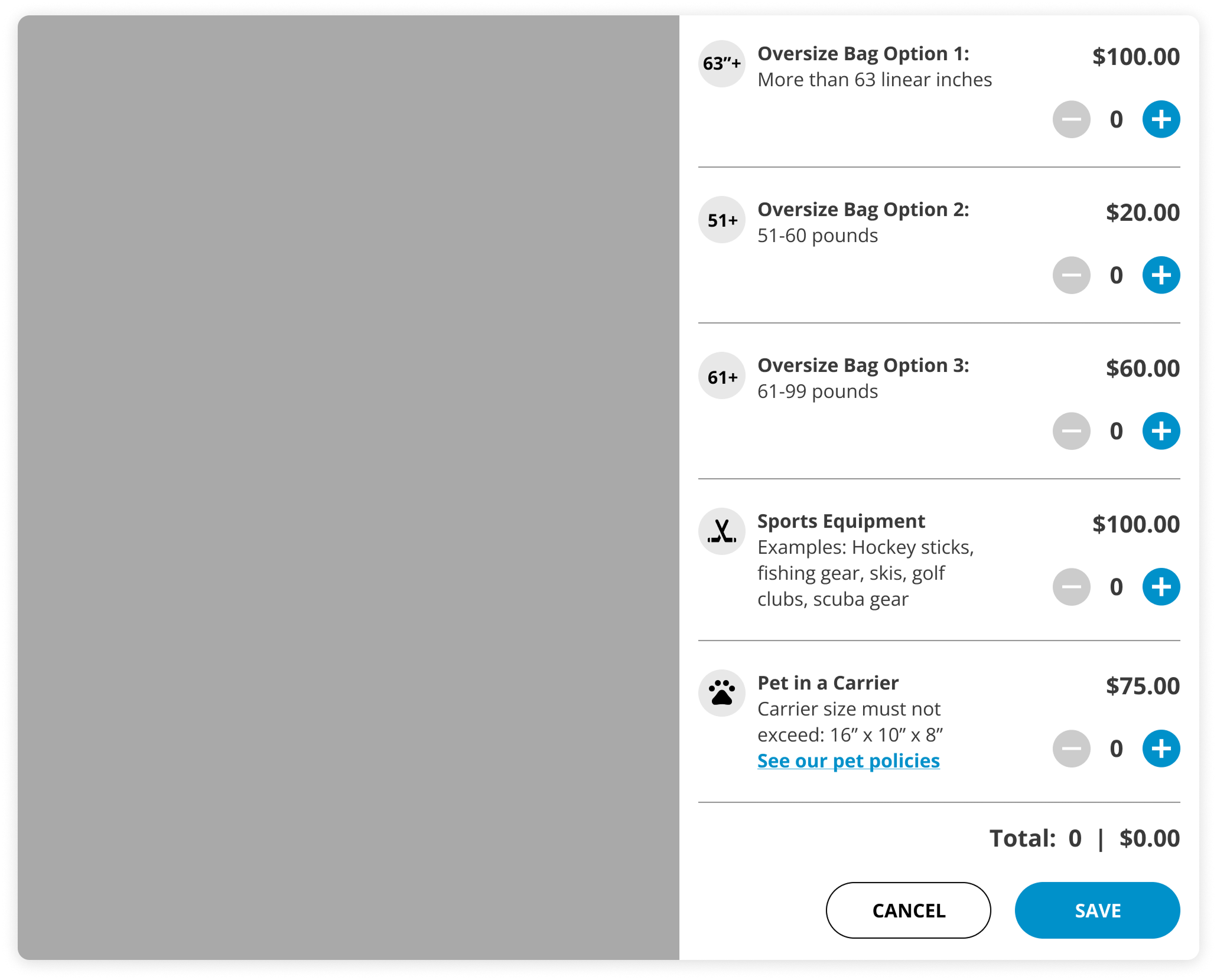
3 of 3: An early concept for a specialty bags and pet right drawer
Navigating a Pivot
After a significant delay between final approval and launch, executive leadership reviewed the redesign and identified opportunities to bring back elements from the previous page.
I collaborated with product to incorporate leadership's feedback with our user research insights to still create an experience that would improve usability.
Left Image: First Bags redesign | Right Image: Second Bags redesign after feedback
Impact & Reflection
The redesign did positively impact the bag attach rate. Within 2 weeks of launch, the attach rate increased by 3.7%.
Over 400 pets were added from the new Bags page within 2 weeks of launch, accounting for at least $30k in revenue.
Incorporating leadership’s pivot feedback allowed me to update the bag illustrations, which was something I had on my bucket list since I started at Sun Country, so it was a win-win!