Online Application Redesign
I worked on a project team that included a UX analyst, a content strategist, a designer/UXA, and several developers to redesign the online application experience at Capella University. We worked with internal business partners to make the application mobile-friendly, to improve the overall user experience, and to improve the experience for self-sufficient applicants.
My role as the web designer mainly involved collaborating and designing the UI and patterns based off of wireframes. More specifically, some of my tasks included:
- Conducting competitive analysis
- Creating an icon font
- Curating and designing icons
- Preparing mock ups with specs for developers
- Building a prototype in Invision for user testing
Project Year(s): 2017-2018
Tools: sketch, illustrator, invision, zeplin, basecamp
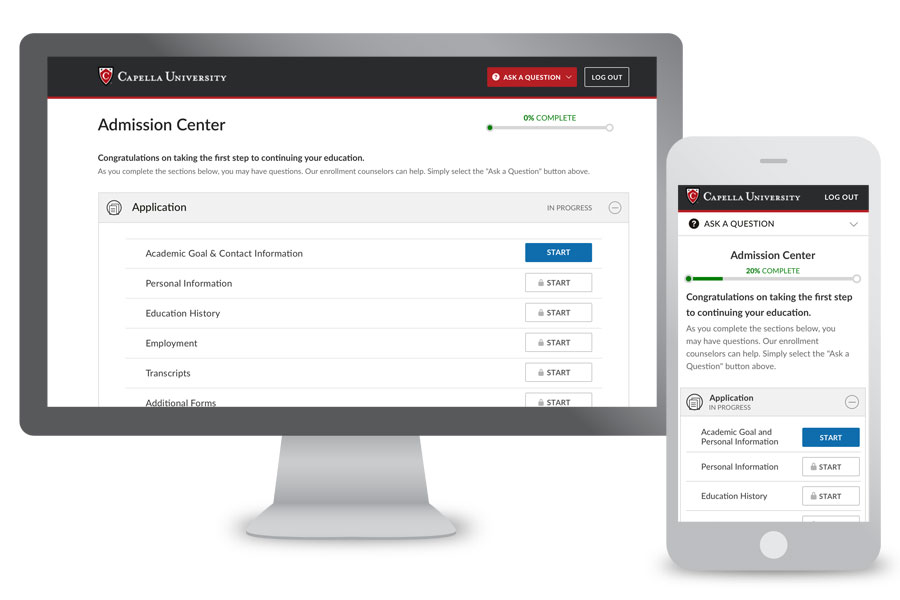
The initial dashboard view, desktop & mobile.

Sequence of screens showing the progression of questions, button states, and form field validation on the Academic Goal page.
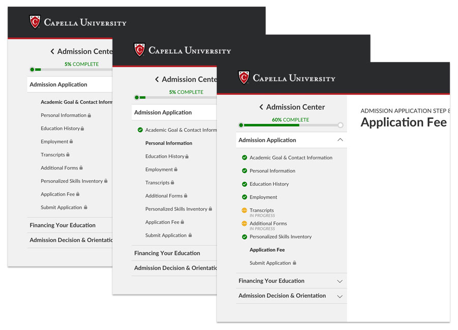
Desktop-size left navigation, showing varying levels of progess.
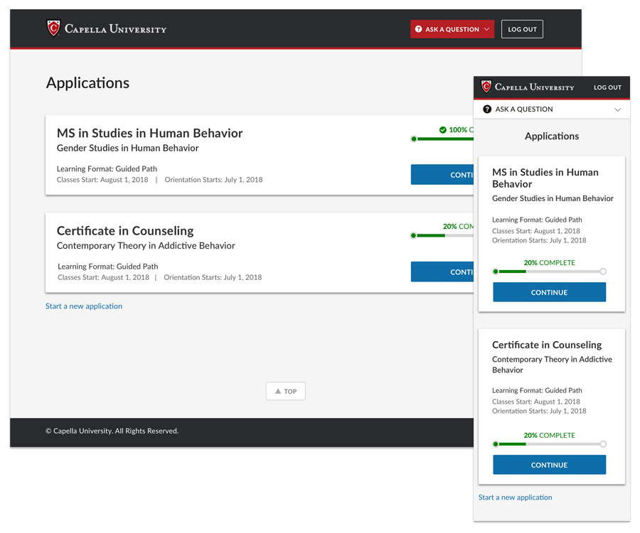
Landing page for multiple applications started, desktop & mobile.
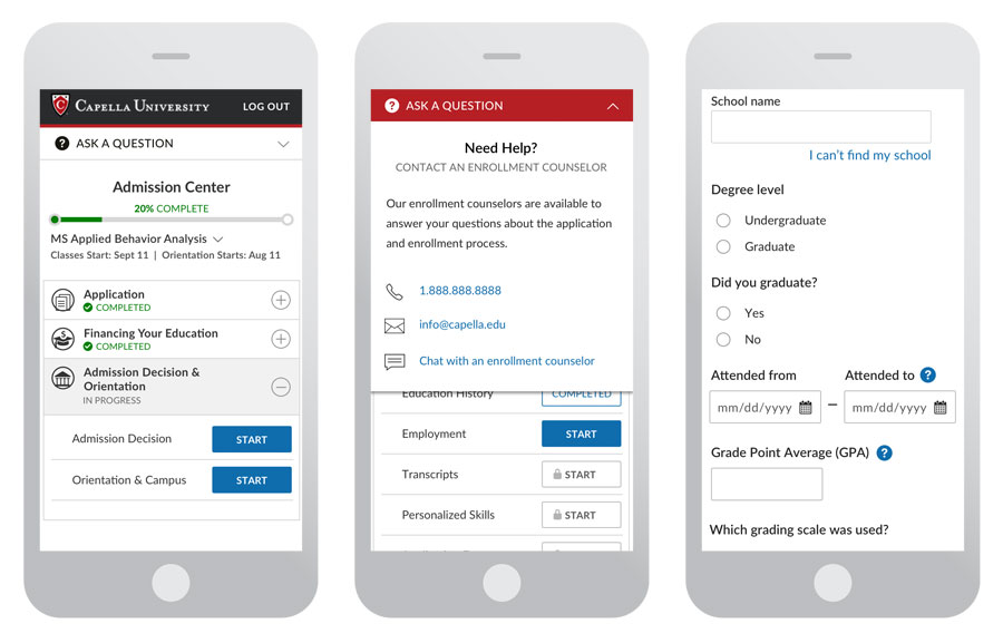
Select screens at mobile size.
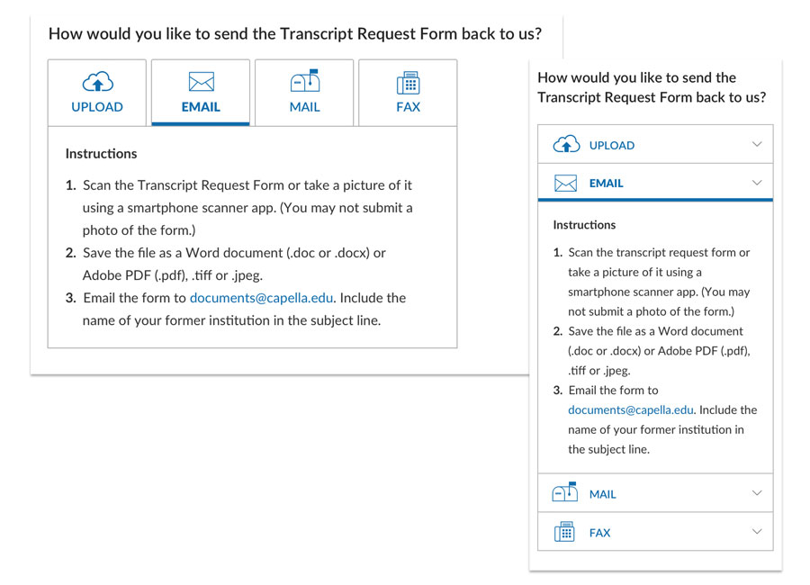
Send option pattern, desktop & mobile.
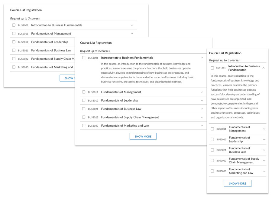
Course list accordion pattern, desktop & mobile.
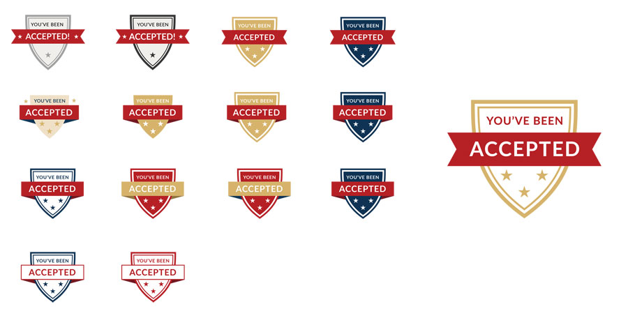
Accepted badge exploration and the final design on right.